
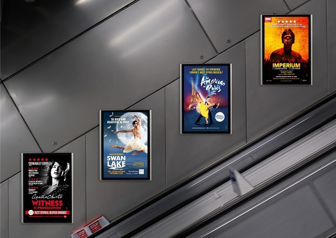
Situated either side of escalators at high points of public traffic, such as rail stations, shopping centres and airports, these panels provide a great opportunity to be viewed by masses of people. Traditionally these have been printed posters, but at some sites digital screens have now replaced these, which provide the option to animate the artwork. Passers-by are travelling and unable to stop to take in large amounts of information so the design of the artwork needs to capture their attention quickly and effectively. Follow these top tips to maximise the best engagement.
1. Concise Copy
It’s vital the copy is concise so that it is easily readable in a short amount of time. If it’s too long then there’s a high chance that it won’t be read in time. This can also occur if the copy is overly complicated so it’s important that it is clear and understandable to be most effective. The copy should be placed in order of importance and grouped into chunks to make it easier to digest.
2. Lead Heading
Naturally you read from the top so the key message, usually a quote or a call to action, should be placed prominently at the top of the artwork to catch the public’s attention and lead them into the campaign being advertised. This is best designed as a concise, stand-out heading: remember a shorter header is much easier to memorise! Try to use a typeface that is interesting but readable and of course relates to the show’s identity.
3. Prominent Use of Campaign Image
A strong visual shouldn’t be overlooked and can be a powerful tool in engaging your audience. The campaign key art or related imagery should be prominent with strategic copy positioned so that it doesn’t become cluttered and allows the image to breathe. The most effective posters are ones that follow the phrase ‘less is more’.
NOTE: Escalator panels have a fairly fast turnaround and are often used to highlight seasonal campaigns. It is common practice to include additional elements – be it a Christmas/Easter/Holiday message/graphic – so be creative in how you can utilise this within your campaign artwork.
back