In preparation for the 2018 season, Regent’s Park Theatre decided it was time for a brand refresh to coincide with their season announcement. This consisted of developing their existing logo, experimenting with different textures and a potential change of font for the show titles/headers. Alongside this we were also tasked with developing a new colour palette whilst retaining the essence of their current branding. The refreshed brand will be rolled out for all the season’s marketing materials, beginning with a new style of season poster.
Show Titles, Logo and Colour Palette
We initially presented a selection of new title treatments experimenting with various treatments, textures and fonts. The new font that was favoured is based on DCC ASH – set in caps but with a larger initial capital – outlined and solidified and then filled with a newly created rolled ink texture. This gave a nod to their original woodgrain texture whilst giving a fresher look throughout their advertising and marketing materials. At the same time we looked at updating their colour palette with a sympathetic choice of brighter, warmer colours that gives more choice for usage across the main shows and MOREOutdoor events.
Once the newly created titles had been given the ok we then looked to freshen their existing logo with the newly created ink texture. In addition, we can also utilise the texture inside other graphic devices and infographics.

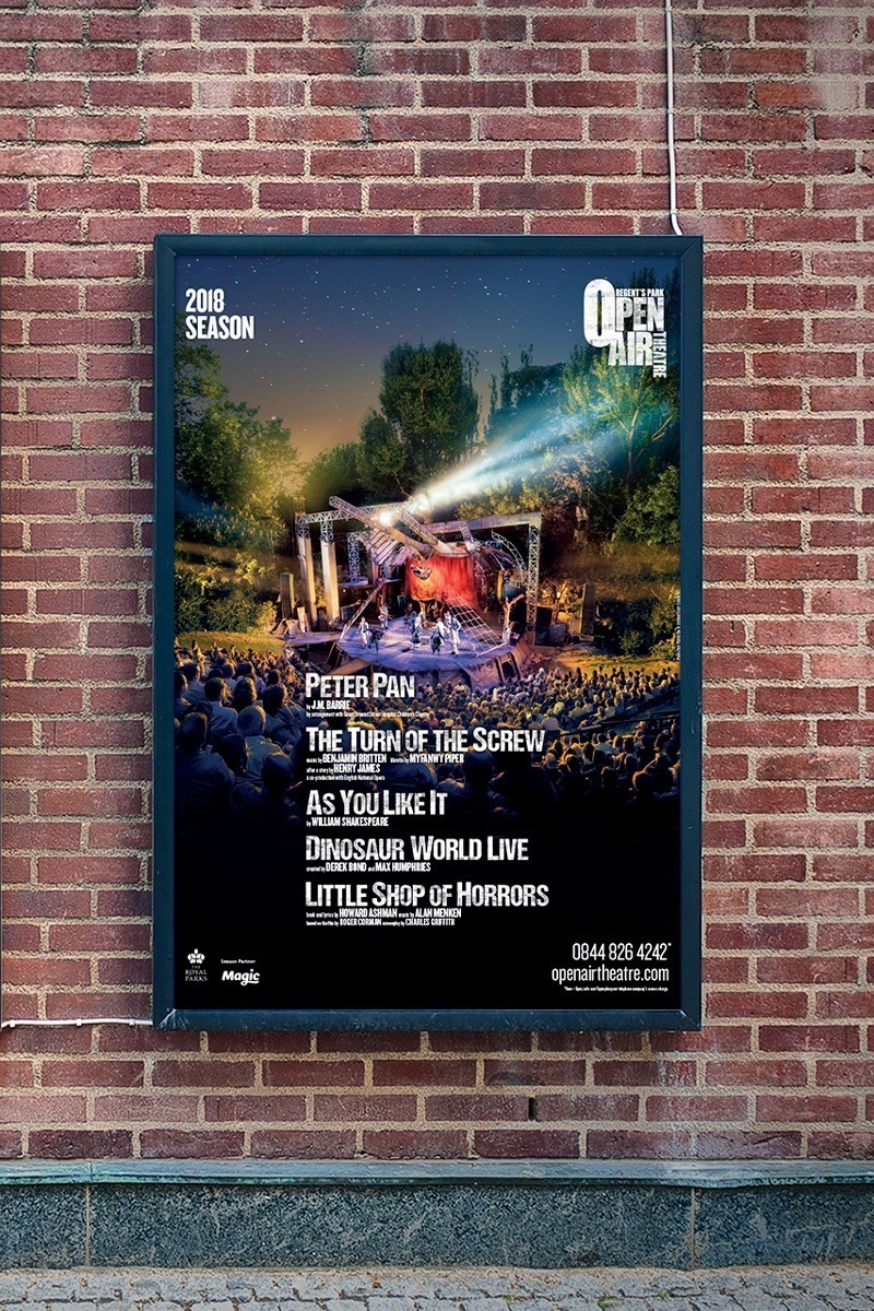
Season Poster
In previous years the production titles have been the focus on the season poster, but moving forward Open Air Theatre wanted the auditorium experience to be the hero and the production titles to play a secondary role. This required a shift in the layout with the production titles becoming smaller and moving to the bottom half of the poster. This allows the venue image to be the focal point on the poster. We were also able to push the vibrancy of the image to really echo the stunning effects of scenery and location that are part of the Open Air experience.

